Visual examples
Download the runnable Python example. It creates a regression interval plot and a classification prediction set plot from reproducible synthetic data. Matplotlib is optional; see installation.
Regression intervals
The first plot compares held-out outcomes with point predictions and 90% conformal intervals. The wrapper encloses the complete estimator; automatic calibration occurs before the estimator is fitted.
Classification prediction sets
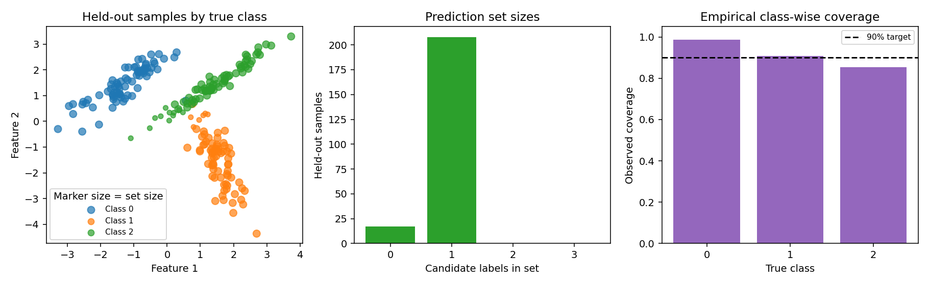
The second plot shows held-out samples by true class, with marker size indicating the number of candidate labels in each prediction set. A companion bar chart shows how often each set size occurs. A set mask is membership data; its entries are not probabilities.
"""Create regression interval and classification prediction set plots."""

import matplotlib

matplotlib.use("Agg")
import matplotlib.pyplot as plt
import numpy as np
from sklearn.datasets import make_classification
from sklearn.linear_model import LinearRegression, LogisticRegression
from sklearn.model_selection import train_test_split
from sklearn.pipeline import Pipeline
from sklearn.preprocessing import StandardScaler

from conformity import (
    ConformalClassifier,
    ConformalRegressor,
    prediction_set_coverage_by_class,
)

# Compare symmetric and asymmetric intervals using identical data partitions.
rng = np.random.default_rng(31)
X = rng.uniform(20, 500, size=(500, 1))
y = 8 + 0.08 * X[:, 0] + rng.exponential(4, 500) - 4
X_dev, X_test, y_dev, y_test = train_test_split(X, y, test_size=0.2, random_state=32)
X_train, X_calib, y_train, y_calib = train_test_split(
    X_dev, y_dev, test_size=0.25, random_state=33
)
order = np.argsort(X_test[:, 0])
x = X_test[order, 0]
fig, axes = plt.subplots(1, 2, figsize=(12, 4.5), sharey=True)
for ax, method, title in zip(
    axes,
    ("symmetric", "asymmetric"),
    ("Symmetric: one cutoff", "Asymmetric: separate tail cutoffs"),
):
    regressor = ConformalRegressor(
        LinearRegression(), auto_calibrate=False, interval_method=method
    )
    regressor.fit(X_train, y_train)
    regressor.calibrate(X_calib, y_calib)
    points, intervals = regressor.predict(
        X_test[order], alpha=0.1, return_interval=True
    )
    report = regressor.evaluate(X_test, y_test, alpha=0.1)
    print(
        f"{method}: coverage={report['coverage']:.3f}, "
        f"lower_miss={report['lower_miss_rate']:.3f}, "
        f"upper_miss={report['upper_miss_rate']:.3f}, "
        f"mean_width={report['mean_width']:.2f}, "
        f"normalized_width={report['normalized_mean_width']:.2f}, "
        f"interval_score={report['interval_score']:.2f}"
    )
    ax.fill_between(
        x, intervals[:, 0], intervals[:, 1], alpha=0.25, label="90% interval"
    )
    ax.plot(x, points, color="C1", label="Point prediction")
    ax.scatter(x, y_test[order], s=16, color="C0", label="Held-out outcome")
    ax.set(xlabel="Distance (km)", title=title)
    ax.legend(fontsize=8)
axes[0].set_ylabel("Delivery time (hours)")
fig.tight_layout()
fig.savefig("symmetric-asymmetric-intervals.png", dpi=140)
assert points.shape == (100,)
plt.close(fig)

# Classification: set size in feature space and set size counts.
X, y = make_classification(
    n_samples=900,
    n_features=2,
    n_redundant=0,
    n_informative=2,
    n_classes=3,
    n_clusters_per_class=1,
    class_sep=1.4,
    random_state=41,
)
X_dev, X_test, y_dev, y_test = train_test_split(
    X, y, test_size=0.25, random_state=42, stratify=y
)
classifier = ConformalClassifier(
    Pipeline(
        [
            ("scale", StandardScaler()),
            ("classifier", LogisticRegression(max_iter=500)),
        ]
    ),
    method="lac",
    tts_kwargs={"random_state": 43},
).fit(X_dev, y_dev)
membership, _ = classifier.predict(X_test, alpha=0.1, return_set=True)
set_sizes = membership.sum(axis=1)
counts = np.bincount(set_sizes, minlength=len(classifier.classes_) + 1)
coverage_by_class = prediction_set_coverage_by_class(
    y_test, membership, classes=classifier.classes_
)

fig, (scatter_ax, count_ax, coverage_ax) = plt.subplots(1, 3, figsize=(13, 4))
for label, name in enumerate(("Class 0", "Class 1", "Class 2")):
    selected = y_test == label
    scatter_ax.scatter(
        X_test[selected, 0],
        X_test[selected, 1],
        s=24 + 28 * set_sizes[selected],
        alpha=0.7,
        label=name,
    )
scatter_ax.set(
    xlabel="Feature 1", ylabel="Feature 2", title="Held-out samples by true class"
)
scatter_ax.legend(title="Marker size = set size", fontsize=8)
sizes = np.arange(len(counts))
count_ax.bar(sizes, counts, color="C2")
count_ax.set(
    xticks=sizes,
    xlabel="Candidate labels in set",
    ylabel="Held-out samples",
    title="Prediction set sizes",
)
class_labels = [str(label) for label in classifier.classes_]
class_rates = [coverage_by_class[label] for label in classifier.classes_]
coverage_ax.bar(class_labels, class_rates, color="C4")
coverage_ax.axhline(0.9, color="black", linestyle="--", label="90% target")
coverage_ax.set(
    ylim=(0, 1.05),
    xlabel="True class",
    ylabel="Observed coverage",
    title="Empirical class-wise coverage",
)
coverage_ax.legend(fontsize=8)
fig.tight_layout()
fig.savefig("classification-prediction-sets.png", dpi=140)
assert membership.shape == (225, 3)
assert counts.sum() == len(X_test)
plt.close(fig)
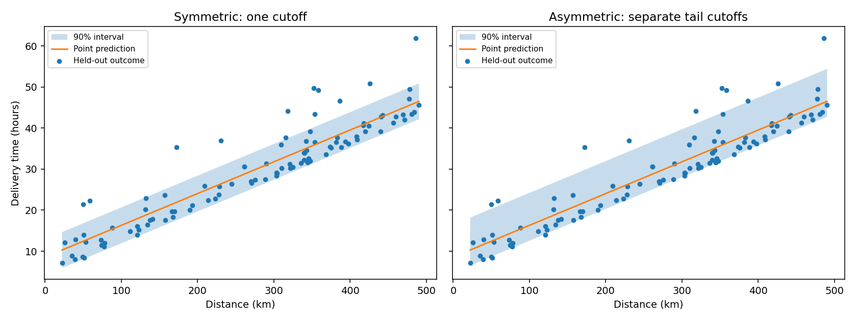
symmetric: coverage=0.880, lower_miss=0.000, upper_miss=0.120, mean_width=8.73, normalized_width=0.49, interval_score=23.32
asymmetric: coverage=0.870, lower_miss=0.030, upper_miss=0.100, mean_width=11.66, normalized_width=0.66, interval_score=18.62
Both regression methods use identical fit, calibration and test partitions. The symmetric method uses one absolute-residual cutoff on both sides; the asymmetric method learns separate lower and upper corrections with equal tail allocation. The skewed synthetic noise makes that difference visible. Neither method estimates conditional coverage by distance. For asymmetric regression, compare the lower and upper miss rates with alpha / 2 as empirical diagnostics, alongside width and interval score. The normalized width divides by the test-target IQR; the example also reports MAE, R² and MSE through evaluate, so point accuracy stays visible beside interval size.
In the classification plot, larger markers have more plausible labels and call for review. The bars compare empirical class-wise coverage with the nominal target; finite per-class sample counts make them noisy, and the default marginal method does not guarantee class-wise coverage. classifier.evaluate also reports overall coverage and mean set size on held-out data.
Next steps
Try the regression workflow, classification review, and cross-validation example. Plots help diagnose a fitted workflow; they do not establish conditional coverage or justify tuning on the final test set.